
This week is full of umami for me. I never experienced hurricane, except in anime “Crayon Shin-chan”. When I drove back home on Friday, I felt I was Turner, having myself lashed to the ship—”Miami” mast, waited for Hurricane Dorian. Nevertheless, it came with great cry and little wool.
- What I’ve done last week
- Read Visual Revelation and Maarten Lambrechts’s website
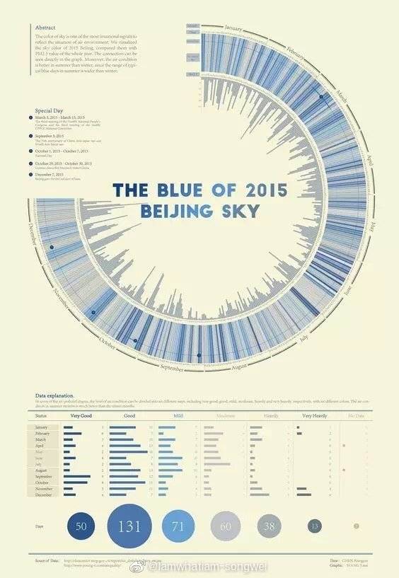
I read the books Visual Revelation. Visual Revelation is absolutely attractive. It’s an old book but not out-of-style. And its theory is simple but not superficial. As a novice, I often sink into the sea of fashion, useless multi-graphic. Like I wanted to do the project about the history of Chinese textile. Because I saw this project ”The Blue of 2015 Beijing Sky”, I thought this kind of circle, Zoomable Sunburst, could also be the best choice of my project. However, the circle hints the yearly circle and the color represents different levels of air quality. Back to my project, the type of chart is not the best way to present my project. And color also can’t hint the quality of fabric.
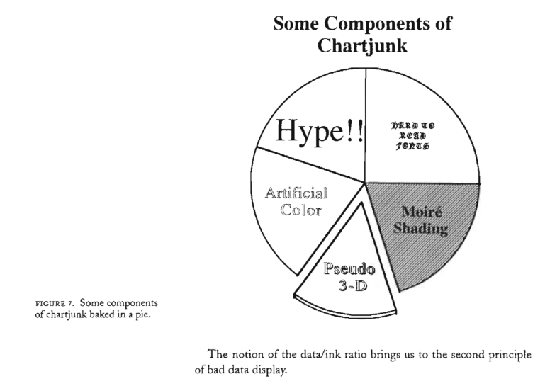
And it’s really funny I went through those mistakes, or I should call them “charjunk”, New York Times and Washington post were made. Professor Cairo told us we should not use pie chart, grid in a line chart, extend graphics to fill white space and so forth. This book further illustrates why we should not do that, causing display data badly.
I love the book’s definition of good data graphics: THE AIM OF GOOD DATA GRAPHICS IS TO DISPLAY DATA ACCURATELY AND CLEARLY. And the theory is also embodied in Maarten Lambrechts’s theory about xenographics. Xenographics is a collection of unusual charts and maps. Many of them are novel, innovative, but they are also easy to understand, even more effective for conveying information. I feel like xenographics is the next stage for professional data journalists with a strong coding background.
- Project sketch
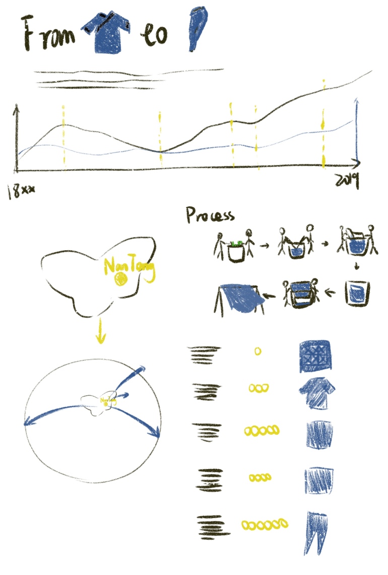
I sketched my project. It’s an original idea. Beginning with the whole picture of Chinese textile export, then I focus on the small city Nantong, showing the process of making blue dying cloth. After that, I’d like to use scroll-telling to tell the story of how Nantong is related to other countries by blue dying cloth and how it changes over time.
And I also read D3.js in Action and googled how to do scrolling-tell. Examples on the website are not complex. However, coding it by myself is another story. I’d like to practice next week.
- What I didn’t finish last week and need to do this week
I didn’t watch a tutorial last week. I need to watch more tutorials this week. And I also didn’t finish data research. I hope I could find enough data to organize.
That’s all, keep going!
